An alternative to NPS for dev tools

This article was originally published on Medium.
When I worked at Snyk, we started experimenting with NPS (Net Promoter Score) shortly after forming a customer success team. We talked with our users a lot, so felt like we had a pretty good grasp on what they thought of our product, but using a sentiment analysis tool like NPS meant that we could quantify how perceptions were changing over time.
Many companies use NPS, and there are some good reasons to use it:
- It’s consistent, so can be used as a comparison across companies and sectors.
- It’s simple — it relies on a single question along the lines of “How likely would you be to recommend our product to your friends/family/colleagues?”.
- It’s easy to measure and track over time. A lot of teams set goals around it for this reason.
However, as a dev tool startup, we found it had the following drawbacks:
- In the early days, we had a relatively small customer base and struggled to get a large enough number of responses for the score to be statistically significant.
- The question “How likely would you be to recommend our product to your friends/family/colleagues?” works well for traditional B2C businesses such as Amazon or Spotify, but not for technical tools.
- Unlike B2C products, it might not be a product the person responding has any choice over using — they may have been enrolled into it as part of their team, which can skew the score. Note: If you’re a B2B company using NPS, a better question might be “If you were to move to a different team or company, how likely would you be to recommend our product to them?”.
- Over time, as more companies adopt NPS, users are becoming desensitised, or even actively fed up with the question. With a small user base, you can end up asking the same users multiple times which is even more annoying!
- Most importantly, it doesn’t really help us understand why they’ve given us a particular score.
An alternative to NPS
Because of these drawbacks, we tried a another approach that still had benefits of NPS, but also addressed the drawbacks. The method we adopted is a combination of feedback scoring and gap analysis.
- Feedback scoring: Turns qualitative feedback into data you can quantify.
- Gap analysis: Helps identify where there’s a mismatch between user expectations and what you’re currently providing.
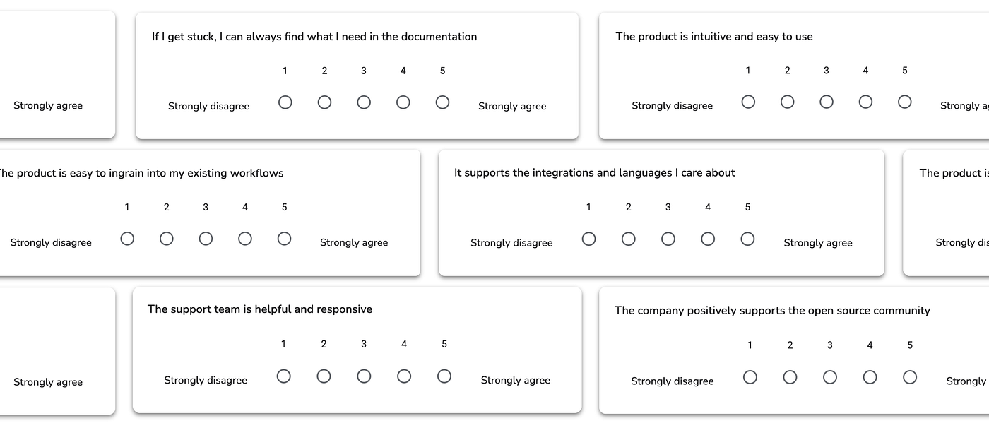
We compiled a list of statements and sent them to users, asking them to rank their level of agreement on a scale of 1–5. The linear scale for the responses is 5 because 10 feels far too broad. 5 gives a good range of responses from strong-medium approval/disapproval, to being agnostic (3).

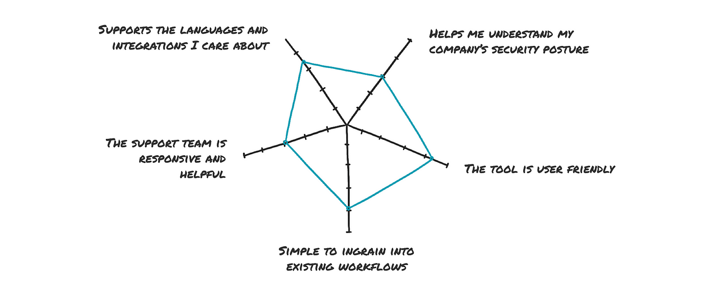
The responses to these statements were then averaged and plotted on a radial graph. This helped us clearly see the areas that users believed we were performing or underperforming in. I’ve mocked up an exaggerated example so you can see it in action. Each survey statement corresponds to a line on the chart, and the average score for the responses to that statement is plotted on each line.

This gave us a good indication of where users felt we were performing well, and where they felt we were underperforming.
Turning feedback scores into goals
In my example, for the statement “the product is easy to ingrain into my existing workflows”, users have given an average score of 3.75. But for the statement “the product is intuitive and easy to use”, they’ve given a score of 1.75. Looking at this, I know I need to do some work to improve the product’s usability, so I’d be pulling in my design team to do some more user research and prioritise improvements in this area.
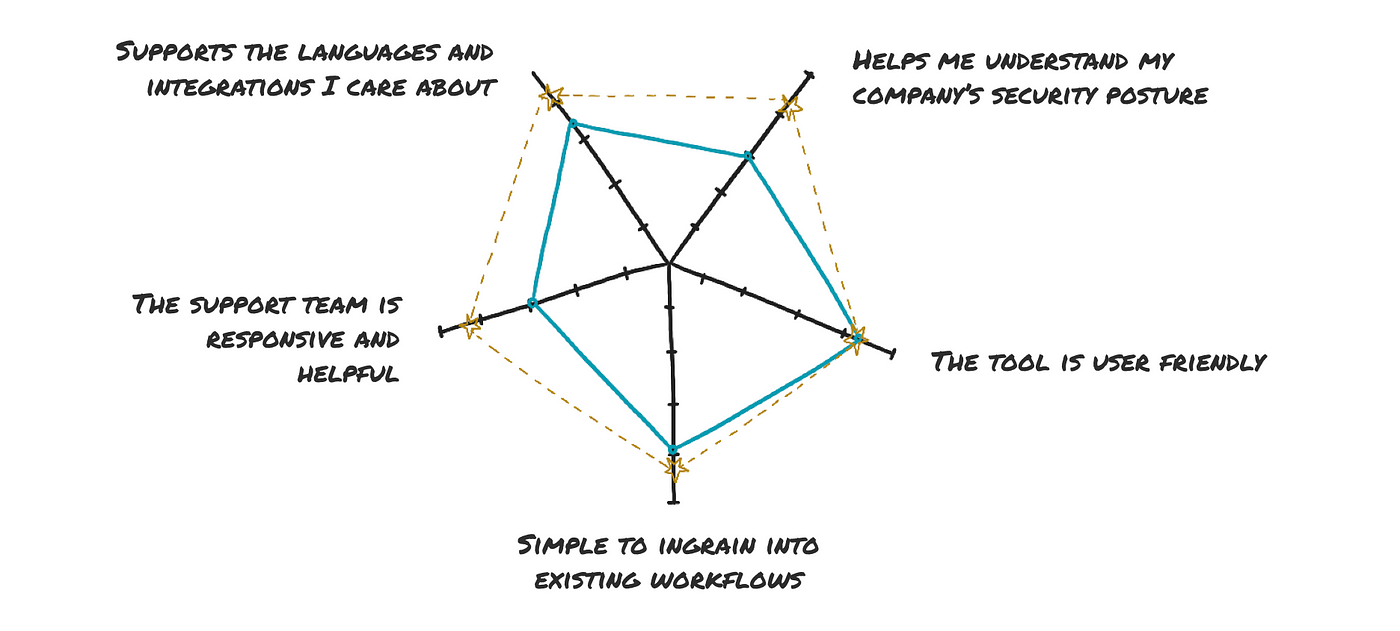
You’ll want to set a goal for the next timeframe, such as the next quarter, that feels like enough of a stretch but still achievable. Jumping from an average of under 2 to over 3 would be a good goal for a quarter, so the goals have been set to 3.5. You might find areas where you’re getting such good scores that you can deprioritise work in this area, giving you more time to focus on the areas that need attention.
Ensure teams are coming up with their own ideas for how to improve the scores, and aren’t relying exclusively on the data — the data is a good foundation, but they should be reaching out to users for further validation.

Segmenting your feedback
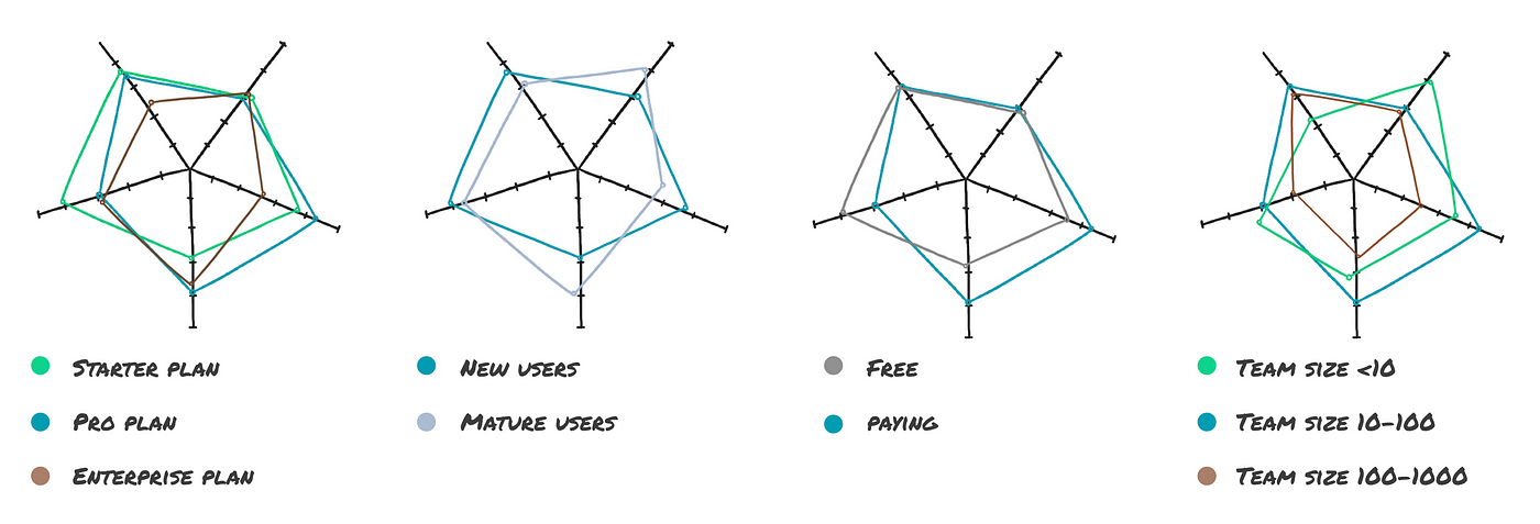
Users will have different expectations and responses based on the plan they’re on, so be sure to capture this information. You can then group the average scores by plan, and if you ask the same question over a set of time periods, you can compare those results with previous ones to see whether you’re improving in that area.

At Snyk, we not only segmented by plans, but also had a segment for our design partners, who would respond to the full survey every quarter. Another segment we captured was new vs mature users so we could see if changes we were making were improving the experience for people who were just onboarding and didn’t have knowledge of what the experience was like before.
Creating your own
If you’re ready to make your own, take time to craft your statements as you’ll need to ask them in exactly the same way each time to enable accurate comparison of responses over time.
Have as many different statements as you want to get feedback on, but don’t ask individuals too many at once or they will give up. If I’m sending a survey, I aim to keep the number of statements as low as possible to increase the chance that someone will complete the form — ideally no more than 6. You could ask users a single randomised question via an intercom prompt.
Always give some space for the responder to add more detail if they want to, such as some free-text at the end. You can get some good insight this way that may lead to additional areas to ask for feedback on in your next survey. Make sure the Customer Success team has access to a feed of the responses so they can reach out to the user to address any concerns.
Feedback statement prompts
Here are some prompts to help you come up with your own feedback statements:
- Customer Support: Have our users been satisfied with the level of support we’ve provided when they reach out to our team? Is it fast? Is our team knowledgeable?
- Values: Do users feel that we stay true to our values? This can be quite broad — you might want to focus on company values such as supporting the open source community, or on a theme such as “do users feel that we are developer-focused?” if it’s really important to your business.
- Purpose: Insert your own purpose here. Do users feel that we enable them to achieve what we promised?
- Performance: Does the product feel fast to use? You can measure this quantitatively, but it’s also helpful to understand the difference between actual performance and the user’s perception of performance.
- Documentation: Is it easy for users to find the information they need?
- Integrations: Do users feel that we offer the right integrations?
- Workflows: Is it easy to ingrain the tool into the user’s existing workflows?
- Language Support: Do we support the languages that our users use on a daily basis?
- User Experience: Do our users find our app easy to use?
- Enterprise-Ready: If you’re trying to break into the enterprise market, this is a good question to ask to understand whether users feel that the product has enough capabilities to meet the needs of the enterprise.
- Security: Do users trust that our product is secure? Perception is important — you might put a lot of effort into making the product secure, but if the user doesn’t feel like it’s secure, that’s also an issue that needs to be addressed.
Template survey and spreadsheet
If you’re looking for something to get started with right away, you can use this example Google Form. I’ve done it as a Google Form because it’s free, has a nice UI, and feeds directly into Google Sheets which I can use to query the responses, but you can use whatever survey tool you already use. The responses feed directly into this Google Sheet and there’s a tab on there that calculates the averages of all the scores for each plan, and generates a couple of radar charts.
Use a range of tools to gather feedback if users interact with your product outside your app. If you exclusively use something like Intercom to pop up the feedback prompts, you won’t be reaching the users who rarely log in and use the integrations and may have a very different experience. You could explore some innovative capture methods like the CLI or GitHub comments to meet the users where they are.
Share with your team
I hope this method gives you some useful insights into how your users perceive your product. For those who are more visually-oriented, I’ve summarised this post in a slide deck you can share with your team.