Improving adoption with the product usage report email

This article was originally published on Medium.
One of my favourite projects to help dev tool startups with is the usage summary report email. This is a product activity digest email that comes at a regular cadence with data on the user or team’s usage of the product.
Although I have no data to prove it, I believe that well-done usage reports are significantly more successful at improving retention than most drip campaigns. This is because they provide value to the user in the form of interesting, personalised data about their own usage.
Email is an area that often gets overlooked, or is considered purely within marketing’s realm. I often hear statements such as “devs don’t read emails” or “email templates are hard to build”. I have some sympathy for both of these statements — as an engineer, I generally ignored my inbox in favour of Slack, and I also disliked building email templates.
However, engineers do read emails that matter to them, and designing nice emails sucks way less than it used to. While tools like Slack and Teams are ideal for “just-in-time” notifications, email tends to have a broader reach (particularly if your Slack/Teams integration is optional) and is better suited to longer-form reports or summaries.
Sending a report to an engineer’s inbox is a great way to show the value your product is delivering and can help build up that value by encouraging certain actions.
A story
Back in the early days of Snyk, we were looking at how we could improve the way we told our users about vulnerabilities. Snyk was originally just a CLI tool, but when we added a GitHub integration, we would send an email notification when a new vulnerability was found in a project the user had monitored. As the number of vulnerabilities in our database increased, the number of emails we sent out to users also increased. Not only did this annoy some users, we also noticed the percentage of vulnerabilities being fixed was decreasing as they became desensitised to the notifications. Some users were turning them off completely.
We talked to users and understood that the value of the content in the emails was high, but it was just too frequent, particularly for people in team lead roles who weren’t the ones actioning them. Users said they would prefer less regular emails that provided a summary of all the issues at once, so we looked into ways we could represent this.
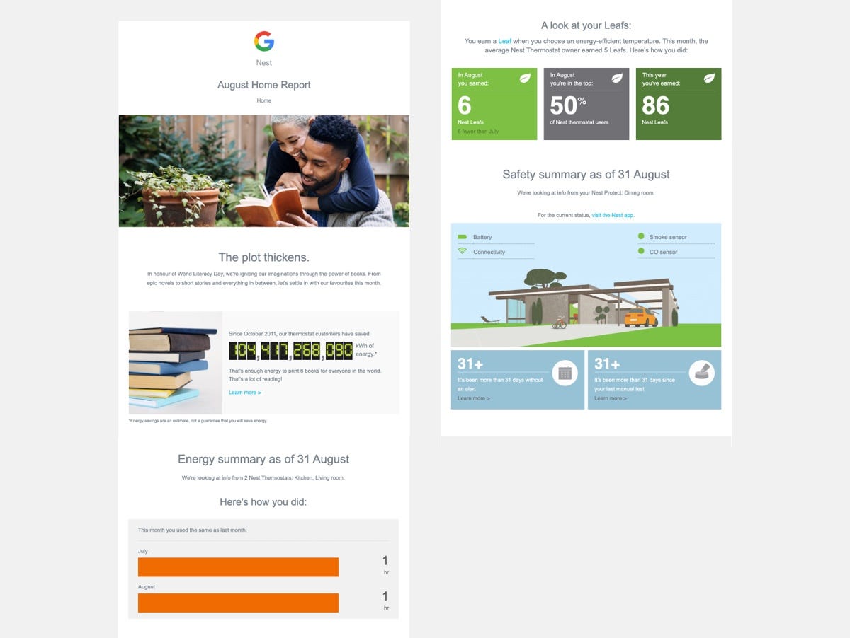
I’d recently installed a Nest, and I really liked the monthly report of our energy usage. It was one I found myself reading, and it changed my behaviour as it encouraged me to reduce my energy usage. I thought this method could be applicable to our users, so we started planning our own.
We had a lot of fun ideas for what we could show on these email reports — for example:
- How the number of vulnerabilities you’ve fixed compares to other users, like how Nest shows whether you’re in the top percentage of Nesters.
- The percentage of repos you aren’t monitoring, to encourage full coverage.
- An embedded graph showing how the number of vulnerabilities has changed over time.
However, these would have added considerable time to build for such a small team, so we decided to build something quick and simple that we could iterate on later.
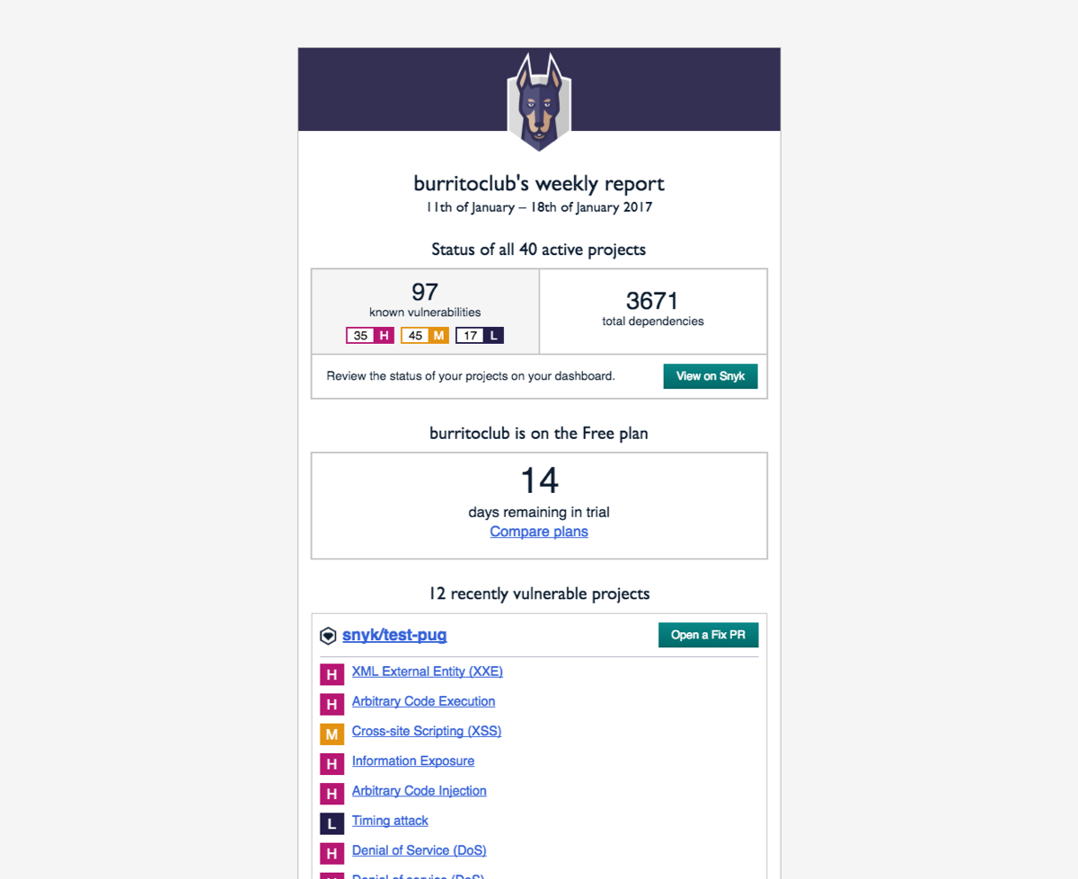
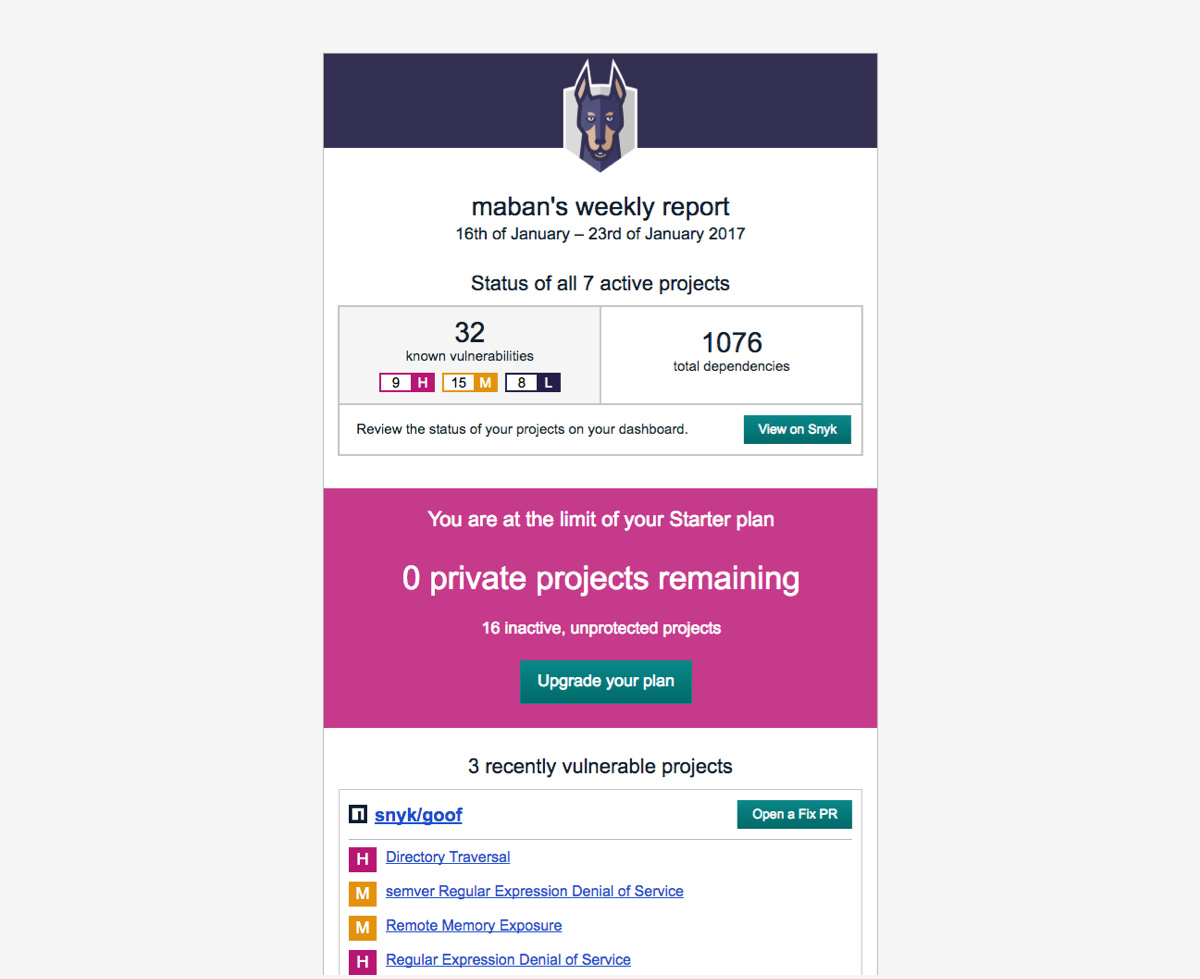
We ended up creating a weekly email summary for each org that showed the following:
- The total number of issues, dependencies being monitored, and number of active projects, with a link to view the dashboard to see the status of all projects.
- The org’s plan status, showing total usage and encouraging an upgrade when the org is close to its limits.
- All new issues grouped by project, with a call to action to fix those issues by opening a fix PR.
I wish I could share some stats on how much the weekly reports improved retention, but it was too long ago. The design hasn’t changed much over the years, which is one credit to its success.

6 tips for building a product usage report email
There are lots of great examples of email reports in B2C, particularly in apps that are trying to make usage a habit. Think fitness, learning, and productivity apps.
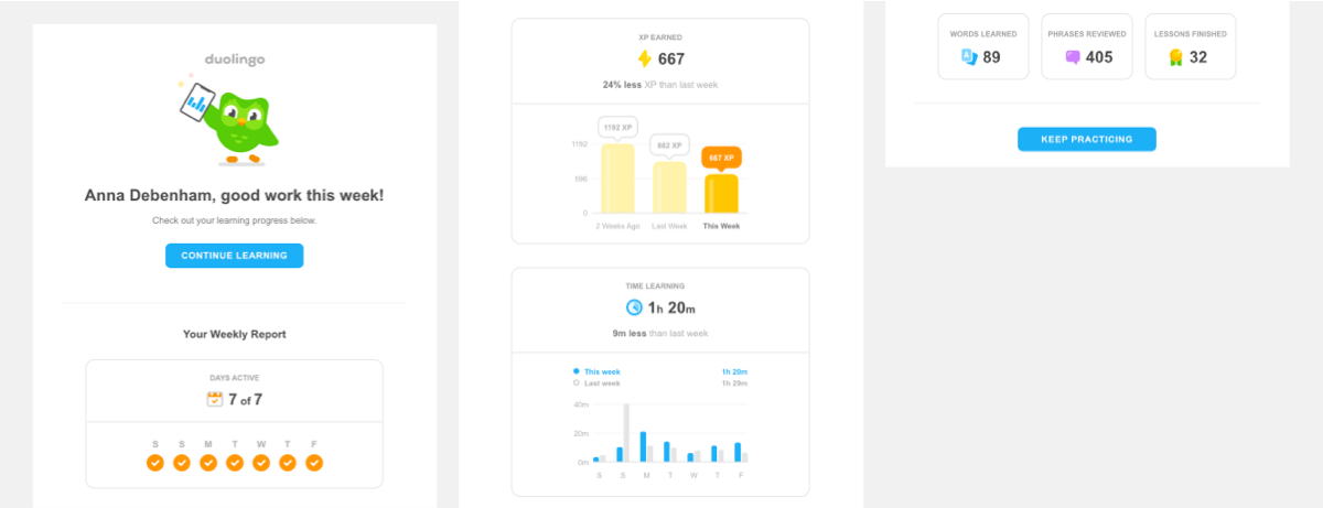
I feel like most devtools could benefit from an email summary. It’s a relatively cheap thing to build and test, and keeps your audience aware of your product without annoying them.
A nice example in the devtool space is dope.security’s beautiful weekly report which includes trends, giving the recipient some context into how that week compares to the previous week. It’s a weekly reminder of the value they’re adding, something that’s needed when the product is quietly doing its job — a little “hey, we’re still here, still keeping you safe!”
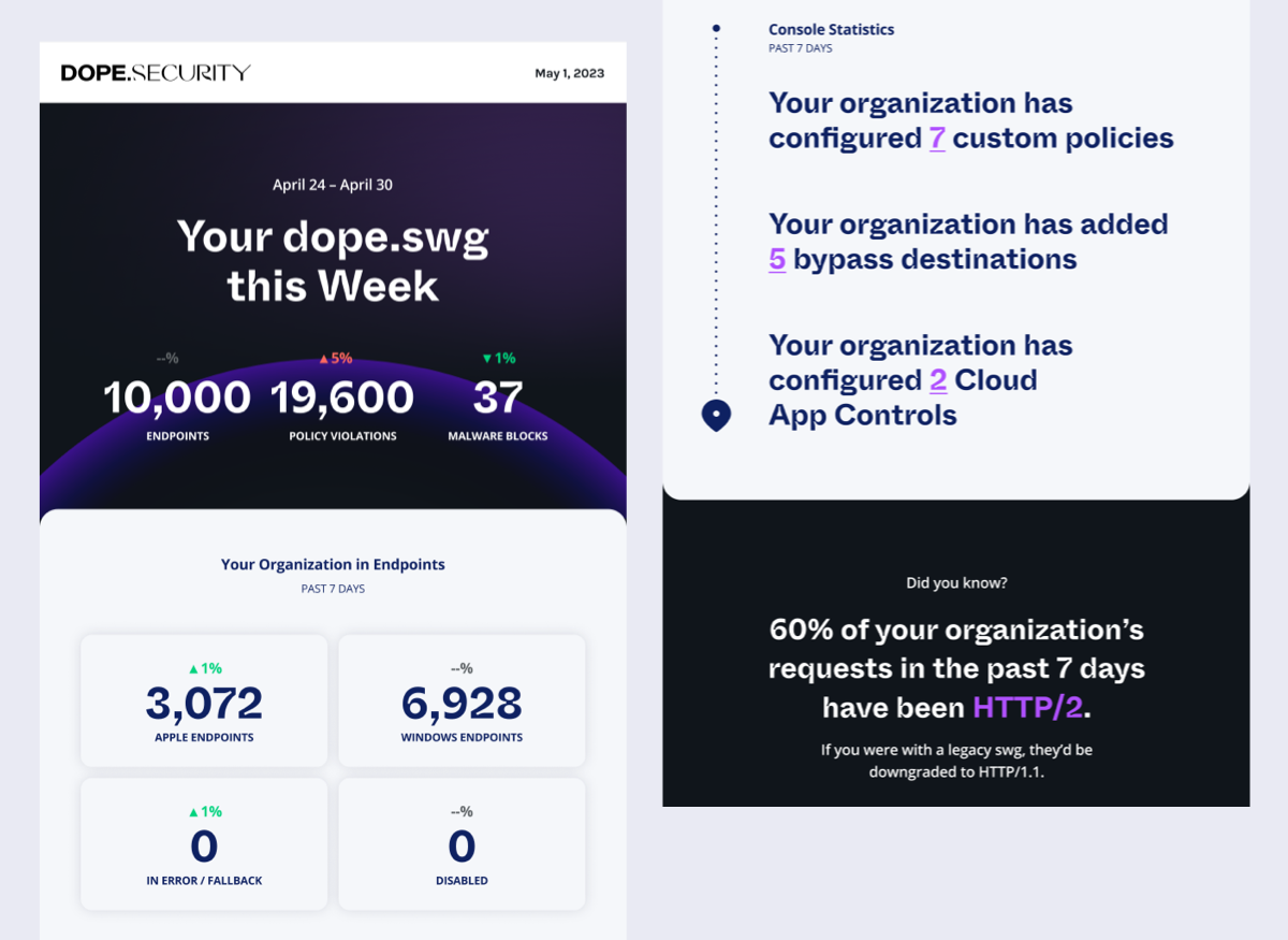
Here are some tips for creating your own usage report emails. Instead of focusing on what to include in them (as that can be very specific to your own product), I’ve provided some things to consider to get the most impact. You’ll also get plenty of great ideas from customer success and marketing, so be sure to include them in the process.
#1: Decide who to design your usage reports for
Dev tools typically encounter 3 key personas: Engineers, Team Leads, and Management (where I’m bucketing roles like Procurement, VP engineering, CTO).
Each persona cares about different information, and will expect it at a different cadence. They all have different touch points with the product — Engineers typically the most frequently, Team Leads at a higher level (reviewing the team as a whole rather than being more operational), and Management the most infrequently, concerned mostly around the original buy, and the value the product has offered especially when it comes to renewal.
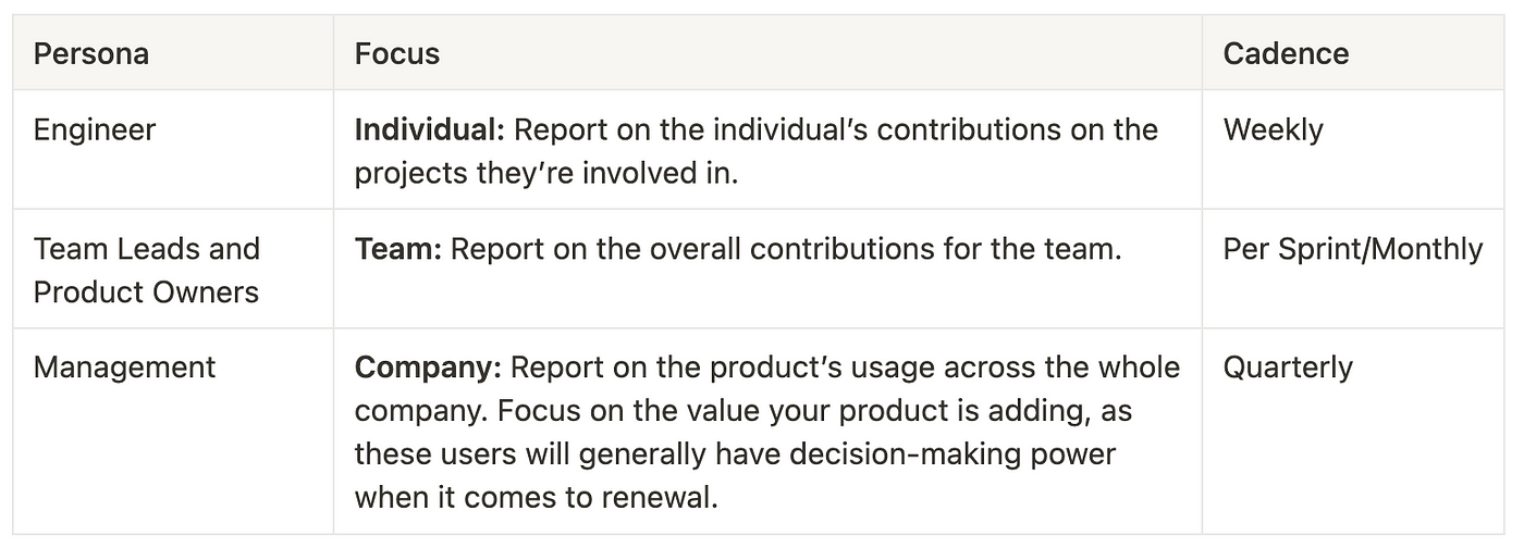
Building a unique email template for all 3 personas is a too much for an early stage startup. When building Snyk’s report, we combined the Engineer and Team Lead focus, although the content was more geared towards a Team Lead. This is still something I’d recommend in most cases — Engineers are likely well catered for with just in time notifications in tools like Slack, but they still find the team rollups interesting and you might not have a way of differentiating them from Team Leads.
Team leads though will be stuck in-between, either getting too many notifications or having to regularly forage for the information, so a summary will add a lot of value for them. They’re also effective product champions.
High level management will have a much slower cadence and they can be served with traditional reports for a good while. They are unlikely to have their own account though, so if you do build a report at the company level, you should give users a way of forwarding those to a different address. This is also good practice for any usage reports that are geared towards teams.
#2: Make it actionable
Snyk’s goal with any user notification was that it had to be actionable. It was never enough to just tell users they were vulnerable (there were plenty of tools on the market that did this already) — we needed to give users a really clear path to what they should do next. In this case, if the issue was fixable, we’d offer users a way to open a Fix PR for all of their issues on a repository at once. If it was a CLI project, we’d link to the command to run to do this.
Think carefully about what you want the user to do once they’ve read the email. This will change depending on the stage they’re at. In this example, we considered a context-specific call to action that would encourage the users to pick a plan if their trial was due to end that week, or if they were close to their limits.
#3: Design for when usage sucks
When designing reports, spend just as much time considering great usage as what a user will see if they haven’t used the product at all. This will be the state for many users, especially new ones.
Your customer success team (if you have one) will likely be concerned about the renewal conversation if a customer receives an email showing the product isn’t being used. Some may even want to suppress those emails altogether so it’s not used as an excuse to offboard. While this may be an overreaction, it’s worth carefully considering this scenario. Fortunately, these reports are a great opportunity to increase usage by customising the message for different levels of activity.
Grammarly has a great email digest that bursting with information — as well as the usage data, it shows trends, comparisons against other users (”you were more active than 99% of Grammarly users”), a call to action to upgrade, education (top grammar mistakes, and how to spell the top word you spelt incorrectly), tips, and also a nudge to turn on additional features. This information is incredibly relevant to the type of user who installs and uses Grammarly.

Vero wrote more about it here. In that article, they point out that Grammarly have 3 different versions of the same email — one for users who tracked more than 100 words in the last week, a second for users who tracked between one and 99 words (providing encouragement and technical support), and the third for users who didn’t track any words which puts an emphasis on reducing churn by adding stronger calls to action.
Be careful not to push usage too hard if users are blocked in some way — for example, you probably don’t want to push a user to import more of their org’s repos if the only ones they have are in languages you don’t support. If that’s relevant to you and you have access to the repo metadata, you might be able to detect the languages first and suggest some suitable ones to import.
#4: Consider when to send the reports
When we were building the Snyk reports, we thought a lot about when the reports should be sent out (how frequently, and on what day). Ideally, you can let the user decide, which is great if they want to schedule the delivery for a certain day and time to incorporate any actions into their sprint planning. For us, this was a lot more work that we were prepared to do at our stage. The predictability of a notification run that happened at the same time for everyone was also useful, as it meant we could spin up additional resources when it was about to happen.
Sending a daily report was too much — we already had this already with the “just in time” notifications that go out as soon as a new issue is found, and for the users not monitoring any projects yet, it would be way too spammy. Monthly felt too little — waiting 30 days to tell a user that they have a vulnerability felt irresponsible. So weekly felt like a good cadence.
We chose Wednesdays as the day to send the weekly report. We figured that would likely be the quietest day of the week for developers, with the start and end of the week being the most intense.
#5: Make the data available as an API
One of the feedback loops for Snyk’s weekly report and reporting dashboard was based on what our customers were doing with our API. We’d look at our top API users and ask them questions about the types of queries they were running, and what they’d do next once they had that data. This usage helped us decide what content other customers might find useful, as well as what action we might be able to automate or provide an easy workflow for next.
Pulling the data that goes in your email report from an API gives your teams a lot more flexibility into where else that data is presented, and helps ensure it’s maintained. If you make it available externally, it also gives your customers the option to build their own custom reporting, which you can use as inspiration on how to improve your own.
#6: Keep it fresh
While it’s important that these reports are personal, you don’t have to restrict your content to what’s going on in the user’s world (although that should be front and centre). Stuff happens in your product, so you can use that as an opportunity to call that out too, such as…
- Your changelog, to showcase what’s new.
- Latest blog posts.
- Tip of the week.
- Upcoming events you’ll be at.
This is a nice way of giving users a roundup of what’s new in your product without deluging them with different marketing emails, although with some of these, it does require some effort to pull something new together each week.
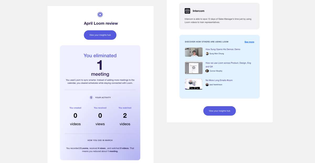
The annual report
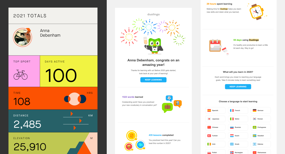
In more recent years, the annual report has become popular. Think Spotify’s Wrapped, Strava’s Year in Sport, and Duolingo’s year in review. I love this as a trend. These digests are designed to be shared — the goal is more on growth than retention — so it’s packed with eye-catching infographics. Not all of these examples are emails, but they still focus on showing personal value.
These annual reports can take a huge amount of effort to produce, but the payoff makes it worth it. Here’s what Duolingo had to say about theirs:
As we improve the experience, the metrics prove that this is an engaging and motivating campaign — we’ve seen a lift in lessons completed and time spent learning after learners flow through their Year in Review. Millions of users share their Year-in-Review cards on social media, making #Duolingo365 a trending hashtag on Twitter every year. And, maybe most importantly: In 2021, we saw a significant spike in new users after we launched the campaign, which suggests that many people saw the Year-in-Review stats being shared across social media, and wanted to join the fun!
Hopefully these examples give you the motivation to create your own!

